Wednesday 15 December 2010

OUGD301 Evaluation


This is by far the best module i have done since starting this course, which is pretty obvious really but im really proud of myself as I know how hard I have worked to produced good results. Although not everything was a smooth journey i have learned some very important lessons and have understood myself as a designer and what my values are.

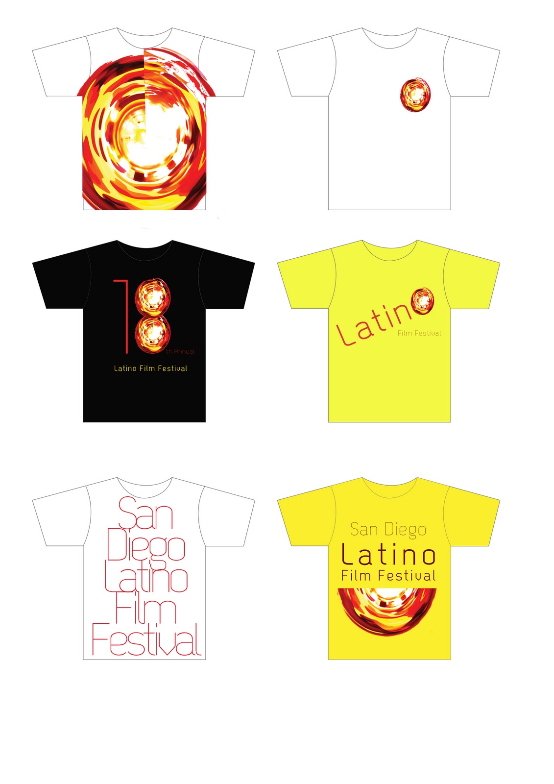
At the beginning of the year we wrote our rational and i found this quite hard, a few attempts later and i had something that i think showed me as a designer. I feel I now have a range of work that reflects my rational. I think this helped me keep a focus in my work, as throughout the past years I have been a bit of a Jack of all trades which isn't good, but i was scared of restricting myself to much. However i managed to overlap some of my briefs in terms of formats and similar content materials. Both the San Diego Film Festival and the Balloon Fiesta projects dealt with promotional material in formats such as posters, tickets, publication and bus advertising. Even though the approaches to the projects are different I feel i have come to a very similar point in resolving them.

Look back over all my projects I have a few highlights that stand out for me as being more successful. The newsletter project was driven by the paper folding and the layout of the page, I really enjoyed experimenting with different formats and felt that it was a strong point in my work. Also in the imove project, the format and folding of the products is what drove the work. The magic cube was a strong piece due to the folding cube format and was probably one of strongest responses to a concept I had produced and this was resolved on a really quick turnover at the Stone Soup Studio in half a day. Another of my strongest projects I felt was the 1st Brief Astronomy, the resolutions weren’t as up to scratch as I had hoped as I had a lot of trouble with the printing, but it is another of the strongest responses to a concept that I have. I would love to develop this project more and take it to its full potential, as I didn’t timetable for this to be such a big brief. I have learned through this the importance of a strong concept, there is something to work against and I know we have been told this before but it gives a point to the work. After three years I have finally learned this.

One major skill I have gained from this module was my typography, as I have been at Stone Soup they are very particular about typography and as I was working on designs with given content, this was my main focus. I feel I have a really deep understanding about typographic elements and how they work in a design and I will be using these straight away for the next module. Stone Soup has also given me an understanding of a live brief and working with a client and all the limitations and about budget for print. This is invaluable and I was surprised how things work behind the scenes, as well as now knowing a rough estimate for printing costs, which will be great on future print work.

A real let down for this module for me was my 2nd brief for Bristol International Balloon Fiesta, I was really excited about this brief and got stuck into it and produced a range of work that I was proud of. However when it was crited unfortunately not everyone else loved it. The imagery used was not suitable and so was recommended to change. The downfall of this was that I left this brief standing to come back to later as I had timetabled it to be finished, but when I came back to it I was out of sink. It was also hard as after I had experimented with other imagery as I still preferred the original but it had to be changed. I ended up with something that I wouldn’t use as a portfolio pieces and something more to please the people around me. This was the wrong decision but was to late to change it and so I regret the process I had for this project, but again it has defiantly taught me how to approach things for the future.

The time management I had on this module was not kept well at all, it was very hectic working with 2/3/4 briefs at one time and I had no idea how much time to set myself for each one! I must resolve this issue before next module as I managed to start 2 briefs that were unfinished and hardly developed by hand in.

All in all though I have really enjoyed this module, I think I am really developing my own approach and producing work that show of my skills. Just have to make sure I remember all this for the next module.


Tuesday 14 December 2010

Stone Soup - BOARDS


Artwork - BOARDS


Latino Film Festival - BOARDS


Latino Film Festival - t-shirt experiments


I ran out of time to develop the t-shirts so i decided to take one design and adjust it to fit in with the identity. The shirt will be worn by staff members of the Latino Film Festival so that they are identified as part of the event.


Balloon - BOARDS


Balloon - Billboard Change


I have applied the image to the billboard and tube station advertisements so that this identity runs through the whole range of advertising.


Balloon - Poster Change


Again i have swapped the images so that the poster isn't pixelated, and to keep the imagery in conjunction with the rest of the material. 
The poster works really well with this image, however it does look a little flat compared to the original image. this is a shame as i wanted something that looked realistic and that you can tell what is going on. But it does capture a light airy feel for the family.


Balloon - Publication reduced

Origional 16 page publication

This is the original booklet with the new front cover.


Reduced 8 page publication

This has the new front cover but the booklet has been reduced by half. This was suggested to me my Graham as it made sense due to the low budget this promotional material has. This works really well, i though it would have been really cramped but i have managed to lay it out well.


Balloon - Image tests


I have been using the new high resolution image and applying into to the rest of the material. I thought i could get away with just changing the picture but as the image has a different tone I had to reconsider all the elements on the page, but still keeping the original identity.

I have used blue boxes to outline the type instead of the white boxes as they sit better on the white background of this image. I have also altered the typography of the title as the kerning was a bit to big so now it now looks easier to read.


I have tried this again but just keeping the balloons grey scale and i really like the style of this, i think this is a really strong identity. However this is to far from the identity i have created so far.


I have tried a darker contrast for the balloons which makes them more prominent but i think its to dark, they don't have the light air feeling to the piece.

Artwork - Tabbed Pack Mock Up

Artwork - Flip Mock Up

Artwork - Folded Leaflet Mock Up


Artwork - Poster Mock Up

Stone Soup - Magic Cube

On my last day on this project at Stone Soup i had the idea to produce a magic cube which would support a really strong concept! although i know the budget wouldn't allow this sort of product i wanted to give it a go and see how it works and how its used. 

The final product came out really well, after a few very frustrating attempts, but the cube works well and i think it really gets a sense of movement across to the viewer. I really love the folding to this piece, always revealing something new, never coming to the end and never having to start in the same place. 

I showed this to the Stone Soup team and they all really liked the idea of it and thought it could be a really strong piece for them, if only they had the budget. The only thing that dosn't work with this piece is that fact that the campaign logo is unseen until you have picked it up and played with it and even then could easily missed. 

If i had more time i would like to address this issue and maybe use the logo throughout or somehow combine the two. 

I think it was important for me to try this even though it was out of budget, as now i have the knowledge of this product and i you should never disregard a good idea because of other restrictions. 


Stone Soup - Burst Leaflet Final

My second leaflet idea was one that I was trying to keep just within budget, so trying a few finishes and techniques but nothing to much. 

This leaflet deals with movement in a physical way by getting people to open it but in a unexpected way as it folds up from the bottom right corner.

I wanted as much impact on the front so that people would pick it up, so i tried a few variations of layout for the images and how they would sit. 

This first layout was one impact image placed on the front, this is a great way to show something impact on its own and just have the focus on this one image. However this also means that if the view is not intrigued by the front image then they would not be inclined to pick it up, which of course is the point. 


This second layout is using 4 of the image together and placing them in a wheel formation around each other so that you actually have to turn the leaflet around. 


This front is i think the one that works the most as you have the impact of the images but people are still able to read it properly.


Stone Soup - Burst Leaflet Back and Front

These are some of the layouts I have been experimenting with for the imove burst leaflet. They need to look as appealing when open as they do close, while keeping the viewer intrigued and moving the leaflet.

The idea for this layout was so they would have to turn the leaflet round like a wheel in order to read the captions. However i think this can be very confusing, especially on a commercial level and people would loose interest or just find it to difficult. 


Having the 4 larger images makes the impact stronger but only presents a limited selection of the images and could prevent from getting more viewers to respond to the leaflet.


I have experimented with using 4 images per square and so a wide range of images but having them lined up in the box they are eaily viewd and understood. Again i have tried to incorporate this turning action but as there are 4 images the right way up at one given time.


Stone Soup - Final Leaflet


This is the final leaflet that was chosen for the campaign as it was the only one that fir within the budget! It cost £349 for 5,000 which is really good price. 
This is a 190mm x 190mm double sides leaflet that promotes the imove campaign and would be distributed within supermarkets and family days out.


Stone Soup - Leaflet Mock Up


The idea for this leaflet was to have a reveal element to it, so again the view has to interact and fold it back. The top layer would be tracing paper that has the captions printed on it and then the images would be revealed underneath. Unfortunately the binding wasn't secure enough and this would have increased the price.


The back section has a cut out section which has the imove information and logos contained in a purple block. However again this wasn't secure enough, in practical terms this would be get ripped very easy. Therefore this would not be a great idea for a mass produced leaflet.

Stone Soup - Leaflet Back Layout


even though this leaflet is on small budget i really want it to be a great design that gets people to notice it. I have experiment with the layout of the back so that the information is shown in a way that is easy to understand.

Here i have laid the information in a purple box in the centre of the leaflet but adjusted to the right. The layout has been very focused on lining everything up to a specific grid.


Here is the same layout but adjusted to the left to balance the page out.


After talking with Ben he though it might be better to have much more focus on the information as there are still enough images on the front. Also i took away the purple box so that the sponsors didnt look to cut off from the rest of the information.


This is the same design and layout but swapped over so that the type is on the right side of the leaflet instead of the left.


Stone Soup - Leaflet Front Layouts


The front of these leaflet is going to be just the images and captions, but i want this to have a big impact on the viewer and make them want to pick it up.

2 x 2 images


3 x 3 images


3 x 3 images arranged with a rotation.


4 x 4

5 x 5 images

Although i really like the leaflet with loads of image, i think it looks a little full and overwhelming so i am going to go with the 3 x 3 images.

Stone Soup - Concertina Leaflet layouts